Above the Fold in Web Design: What It Is, How to Use It, and What Not to Do
Nobody cares what’s below the fold if the top can’t grab their attention.
The above the fold is the part of the website you see as soon as you land on a page, without scrolling at all. The term comes from newspapers. Basically, what you’d see before unfolding the paper. But here, we’re covering everything about the above the fold with web design, not newspapers.
We’re going to go through:
the uses for the above the fold (and there are more than you might think),
the different designs and flavors it comes in,
common mistakes people make,
and some stats and case studies to back it all up.
We’ll mostly focus on homepages, since that’s where the above the fold matters the most. But we’ll also touch on subpages and landing pages.
Why the Above the Fold is So Important
The above the fold is premium content space. It’s the first thing people see, and it’s a deciding factor for whether they scroll down or leave entirely. Whatever you put here needs to be very important.
What the Above the Fold is Used For
Navigation
Navigation is probably the most useful part of any above the fold. But since that’s a whole separate subject, we won’t go too deep here.
Telling Users What the Page is About
The main job of an above the fold is to tell you what the page is about.
On something like an About page, it’s easy. A title in the above the fold immediately tells you what you’re looking at.
But on the homepage, it’s different. You can’t just put “Homepage of [Business Name]” at the top. That’s horrible. Instead, the homepage above the fold should quickly answer three questions for someone who has never heard of you before:
Who are you?
What do you do?
How can you help me?
“Who you are” is usually handled by the logo in the top navigation. “What you do” and “How you can help me” need to be spelled out in text, usually in a hero section with a headline, supporting text, and maybe an image.
Good examples of this:
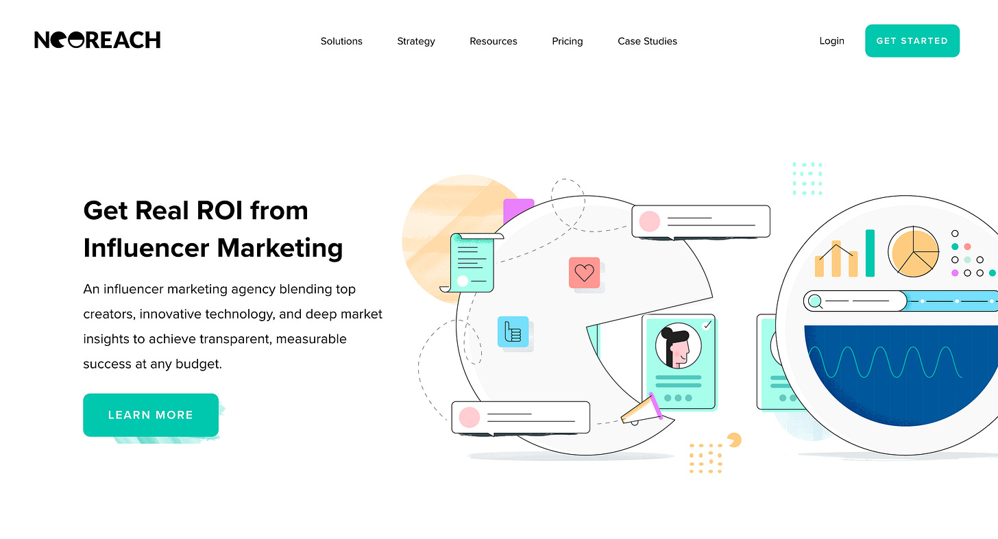
NeoReach: “Get Real ROI from Influencer Marketing” Straight to the point.
Rabbet.com: “Connect the Pieces for Flawless Project Execution.” Again, you know exactly what they do.
Fountain TRT, Polymer.co, all follow the three-question method.
And then there’s the one that just says “Digital Marketing Agency.” You literally can’t get clearer than that.
Now, some bad examples:
“We spot. We add. We exit.” Whatever that means.
An engineering firm that shows a random video cool, but without scrolling, you’re left guessing.
“Every brand has a story. Let us help tell yours.” Too vague. Could be anything.
A site that just shows a portfolio piece as the whole homepage. No scroll. No context. And they’re offering professional web design services. That’s ironic.
So yeah, answering those three questions is the bare minimum.
Calls to Action (CTAs)
Most good above the folds also include a button. That could be:
A contact button
A sign-up form
Something unique depending on the site
On homepages, this usually lives in the hero. On other pages, it might be in the nav.
Promotions or Announcements
Sometimes you’ll see banners for sales, product launches, or time-sensitive updates. This works, but usually sacrifices a bit of user experience if overdone.
Encouraging Scroll
A strong above the fold can create a positive impact that makes people want to scroll down for more.
Ad Space
This is also prime territory for ad placements, since it guarantees visibility.
Above the Fold Design Styles
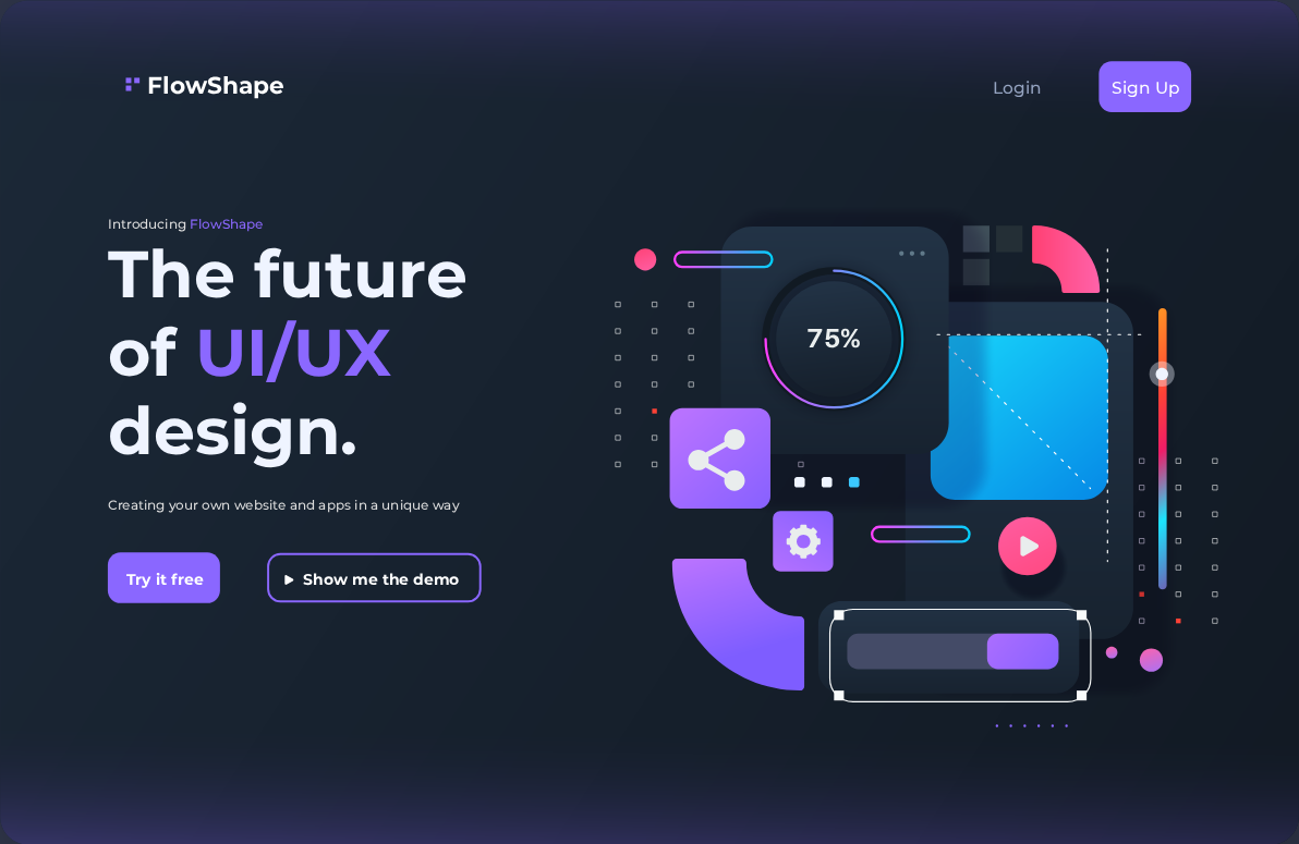
Most homepages use a simple and classic hero layout, a heading, some supporting text, a button, and either a background image or a solid color.
But there are plenty of variations.
Layouts
Two-column: text on one side, image/empty space on the other.
Centered: everything in the middle.
More creative: breaking blocks, overlapping elements, unique visual structures.
Backgrounds
Solid color: clarity and focus on the text.
Image: emotional impact or extra value.
Video: attention-grabbing but risky (more on that later).
Subpages
On subpages, the above the fold is usually just a title bar. Keep it simple, clear, readable, maybe with a background image. A short paragraph under the title adds value.
Breadcrumbs should also appear here (except on the homepage). They’re underrated but improve usability, especially on big sites.
Contact Pages
On contact pages, you might even skip the title section altogether, so the form sits higher up and is easier to access. That could help conversions.
Mistakes to Avoid
Skipping the three questions (who, what, how).
False bottoms: where the above the fold takes up the full screen and looks like the whole page. This makes users think there’s nothing else below. Keep it at 80–90% of viewport height.
Bad video backgrounds: If it’s too distracting, relies on audio, or makes text unreadable, it kills usability. Videos should be simple, cinematic, and loop cleanly.
Poor contrast: Text needs to stand out from the background. Always prioritize readability over making the background image more visible.
What the Data Says
Let’s talk stats.
2010 Nielsen Norman Group study: Found that 80% of user attention was spent above the fold. Makes sense back then, sites were less scroll-heavy, and screens were smaller.
2018 Nielsen Norman Group study: Things changed.
57% of attention is above the fold.
74% within the first two screenfuls.
81% within the first three screenfuls.
So people scroll more now, but the top of the page is still where most attention goes.
Wrap Up
The above the fold is premium space. It’s your first impression, your chance to answer the big three questions, and your opportunity to guide people deeper into your site.
If you can nail clarity, contrast, and usability while avoiding common mistakes, you’ll already be ahead of most sites out there.
People do scroll, but they still focus heavily on what’s at the top. So treat the above the fold as the most valuable space on your page, because it probably is.
The internet doesn’t have to be dull. Hit subscribe on Developer’s Journey and see what’s possible. Click below and subscribe now
Did you learn something good today?
Then show some love. 🫰
© M Usman


