

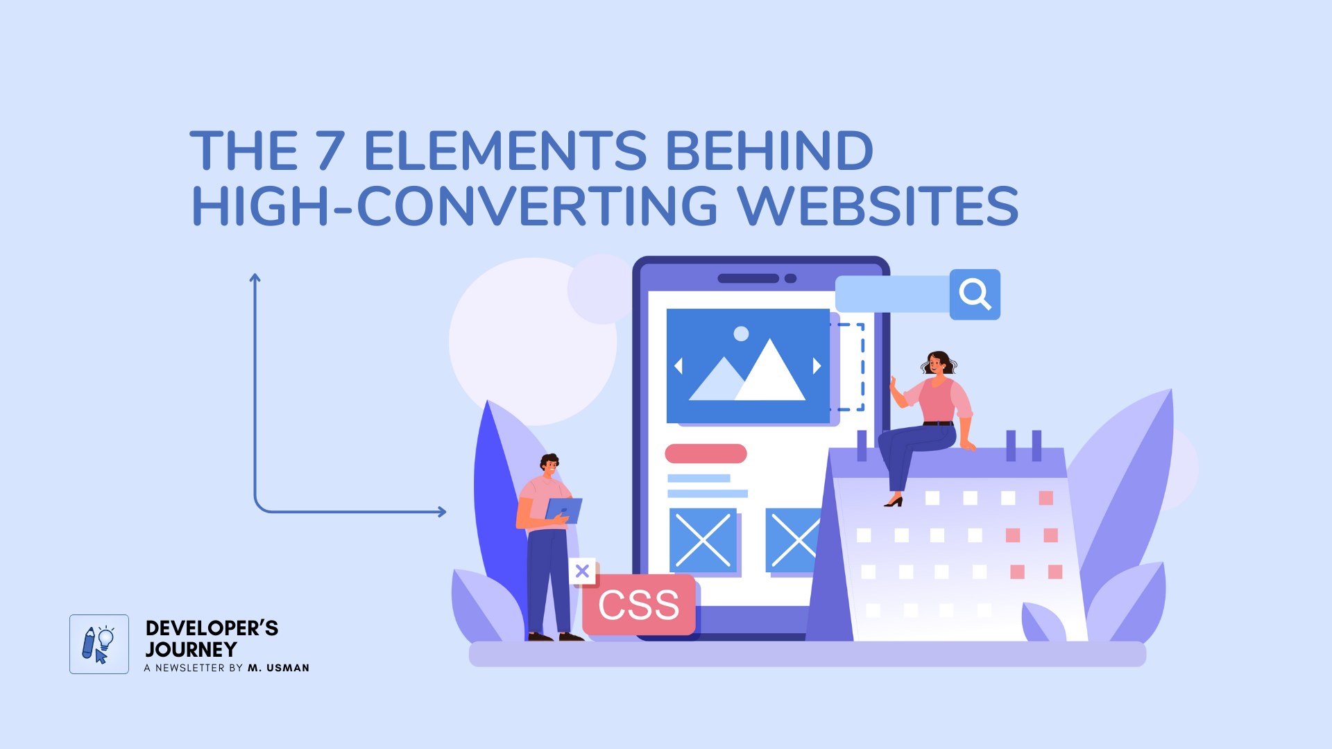
7 Things Every Business Website Needs to Turn Visitors Into Paying Customers
There are seven things that any business website needs if you want to quickly turn your website visitors into paying customers.
Let’s go through all seven so you can see exactly why you need them, and how to add each of these to your website yourself.
You Only Get 10–20 Seconds
How long do you think people coming to your website will actually stick around?
Luckily, we don’t have to guess. A world-renowned user experience research company studied this and found that the answer is 10 to 20 seconds.
That’s less time and attention given to your business than most TV commercials.
At least, commercials have the advantage of popping up over and over again. Unfortunately, your website isn’t nearly as lucky.
But here’s what else they found: websites that show a clear value proposition can hold people’s attention much longer.
1. A Clear Value Proposition
A value proposition is just the unique value your business offers to customers. It’s what sets you apart from your competitors and gives people a reason to choose you.
Sounds obvious, right? But ask yourself, are you really doing this?
Or are you saying things like:
“Welcome to our website”
“We’re the number one choice”
Those aren’t value props. They’re placeholders at best, and they’re terrible at grabbing attention.
How to create a value proposition that actually works:
Think about your target audience and what they’re looking for.
What problems do they have, and how does your business solve them?
What benefits can you offer that your competitors can’t, don’t, or just don’t talk about?
What doesn’t work: using industry jargon or buzzwords that confuse or turn off potential customers?
Where to place it: lead with your value proposition right at the top of your homepage. Then add a clear benefit section slightly further down. Be extremely clear, and use visuals or other design elements to make it stand out.
2. Clean and Easy Navigation
This is something most businesses don’t do well, probably because they’re copying the mistakes of other websites they look at for inspiration.
Think of it like this: if you’ve seen The Blair Witch Project, it does a great job of showing you why getting lost in the woods is bad.
So do your site visitors a favor, keep them on the path.
Here’s what works best:
Lay out your homepage as if there were no other pages on the site. Lead visitors down a clear, linear path from top to bottom, giving them the right information in the right order so they don’t need to visit other pages unless they want to.
For those who do want to explore, keep your top navigation to only the bare essentials that lead to a conversion (About, Pricing, FAQs, Testimonials).
Move everything else that isn’t as sales-focused (blogs, team bios, community pages) down to the footer.
That way it’s still there for people who want it, but it’s not cluttering the path for your more serious, ready-to-go prospects.
3. Prominent Testimonials (With Photos)
A business called X once made one simple change to their website that increased sign-ups by 20%.
All they did was add a prominent testimonial section right on their homepage. They featured quotes from satisfied customers along with their names and photos, which is really how you should do it too if you possibly can.
Whenever you can include a customer photo with a testimonial, it takes it out of the realm of “some faceless person behind a screen” and shows a real person publicly standing behind their words.
That’s the basic psychology behind why it works so well.
What to do:
If you already have reviews online (Google, Yelp, Facebook, etc.) or on your website, move your best 3–5 onto your homepage.
Prioritize testimonials that tell a short transformation story (“This is where I was before, and this is where I am now”). Those are gold.
At the very least, pick ones that really hit on a result or benefit you delivered.
Include the person’s image and a visual five-star graphic so they clearly read as testimonials.
4. Clear Call-to-Action Buttons
This is one of the biggest things most small business sites miss.
If someone wants to book something on your site, can they do it easily, or do they have to hunt around?
If your website is missing a prominent call-to-action button, you’re missing out on sales.
Here’s how to do it right:
Style it like a button, not just a text link. Studies show this alone can increase sales by 45%.
Put it right up top in the hero section (right under your headline).
Repeat it multiple times throughout the page, this can increase clicks by 220%.
Be specific with the phrasing. “Book My Free Consultation” will perform way better than “Contact Us” or “Learn More.”
Make all your call-to-action buttons identical everywhere on your site: same color, same phrasing, same size, same shape.
Consistency is key when it comes to increasing conversions.
5. Video That Builds Connection
Way back in the 1950s, TV stars often did their own commercials.
Psychologists Horton and Wohl discovered something interesting when this happened:
People watching would feel a connection to them, as if they were close friends in real life.
They called it a parasocial relationship, a one-sided friendship between the viewer and the person on screen.
And you don’t have to be a celebrity for this to work.
If you add video on your website, ideally where you’re talking directly to the camera, you can:
Build a bond with your audience
Become the go-to person they think of when they need a business like yours
Make the closing process much easier, because they already feel like they know you
Video can also keep people on your page longer, give them the information they need to feel confident taking action, and even earn you extra SEO points.
6. A Direct Booking Tool
A common roadblock for conversions is forcing people to fill out a generic contact form and then waiting for you to follow up.
That usually leads to back-and-forth emails and scheduling delays, and a lot of prospects drop off.
Instead, use a direct booking tool.
Something like TimeBridge lets people schedule calls or consultations directly on your site. You set your availability, it syncs with your calendar, and it automatically books the meeting for both of you, no double-booking, no friction.
This cuts out all the tedious “what time works for you?” exchanges and keeps the momentum going while people are still interested.
7. Live Chat
Here’s the reality: 96% of your site visitors are just in “checking it out” mode.
They’re not ready to call you or fill out a form yet.
But they are much more likely to engage in a low-pressure way, like chat.
Live chat used to be a “nice-to-have.” Now, if you’re a small business trying to compete, you really can’t afford to ignore it.
Two great options:
Facebook Messenger, works with your Facebook Business Page, and you’ll get chat alerts on your phone for fast responses. You can even retarget those people later with ads.
Warm Welcome, adds a personal touch by letting you greet visitors with a video bubble and allowing them to reply via text, video, or audio.
Responding with quick voice replies can be especially powerful for building relationships (and it’s often faster than typing).
Either way, adding live chat gives you a serious advantage over competitors who don’t offer it.
The Bottom Line
If you want your website to convert visitors into customers, don’t just focus on looks or trendy design.
Focus on these seven essentials:
Clear value proposition
Clean navigation
Prominent testimonials
Clear call-to-action buttons
Video for connection
Direct booking tool
Live chat
Put these in place, and you won’t just get more clicks, you’ll get more customers. If you found value in this article, don’t forget that good stuff, like, share, and subscribe if you’re reading this on Substack or anywhere else.
And I’ll see you in the next one. Thank you.
Did you learn something good today?
Then show some love. 🫰
©
If you try even one of these elements this week, make it the call-to-action button. Consistency alone can increase clicks by 220%. Such a small thing, and such a big impact.
Curious, which of these 7 elements do you already have on your site, and which one do you think could move the needle fastest for you?